Mehndi
Pronounced as “men-dee”
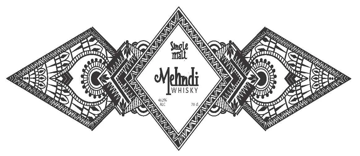
This project focused on branding for liquid bottles. As a designer, I am always intrigued by the creativity on alcohol bottles. So, I chose alcohol as my liquid. This is Mehndi, a fictional Indian whisky brand that features 3 flavors: bourbon, rye, and single malt. The brand gets its name from the body art, also known as henna, that originated in ancient India. Mehndi is associated with positive spirits and good luck.
Final
A fun fact I found when researching Indian whiskies is that the word “whisky” is either spelt with an “e” or without an “e,” but it depends on the country. For example, American whiskey is spelt w-h-i-s-k-E-y because the word America has an “e” in it’s name, whereas Indian whisky does not have an “e.”
Inspiration
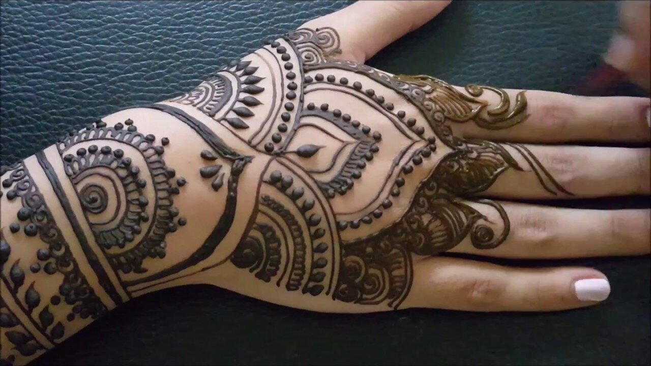
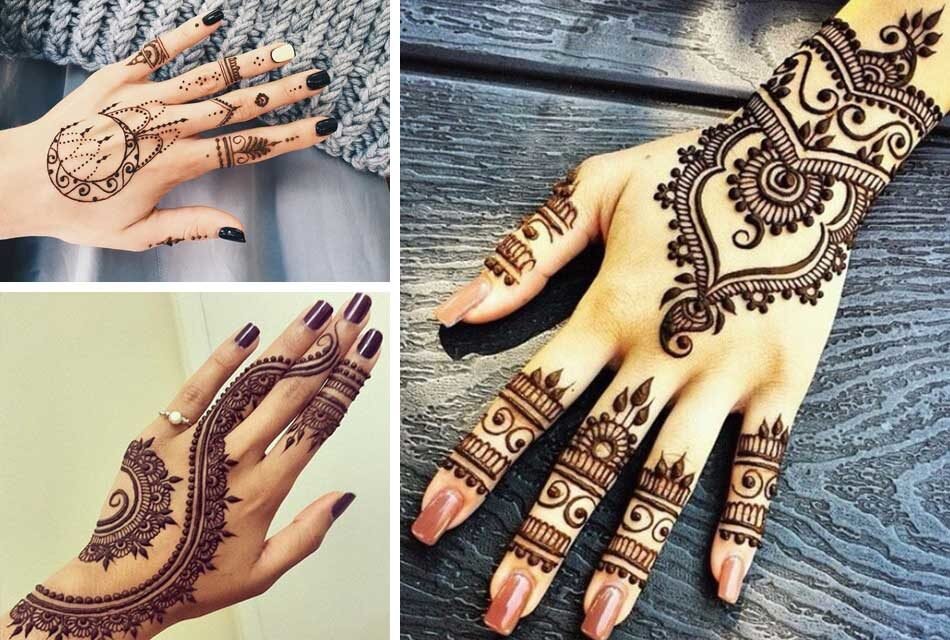
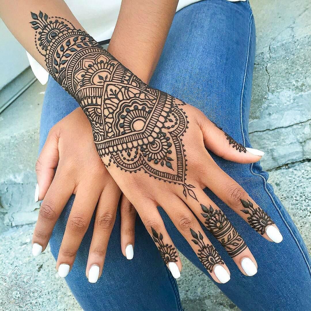
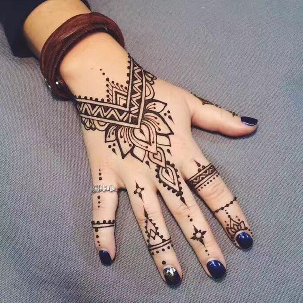
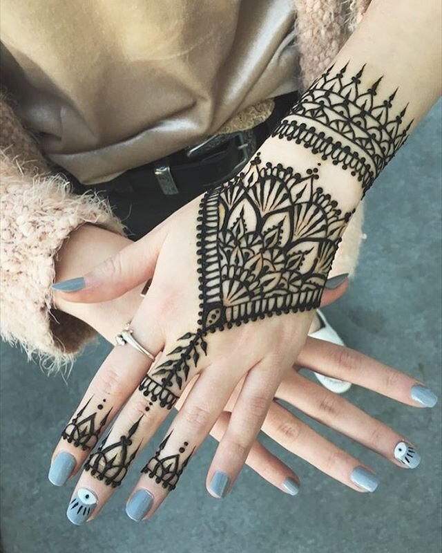
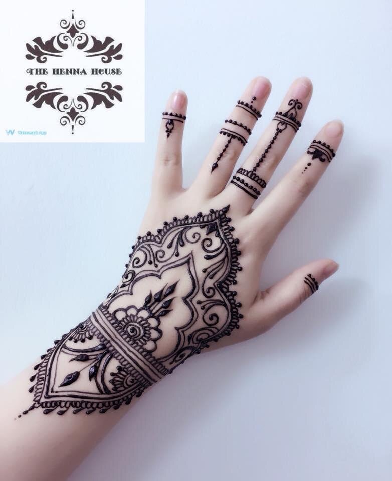
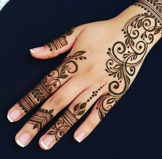
In developing the labels, I combined different mehndi designs. Each bottle design corresponds with its flavor of whisky: Bourbon is smoky, Rye is spicy, and Single Malt has a bite. One of my design challenges was creating the typography. Much like henna, I hand-crafted the text for the name. To counteract the intricate henna designs, my solution was to design a slab-serif font that would mimic the playful designs of henna, but also provide structure.
